In 2026, packaging has become a visible handshake between a brand and its audience. It appears before the product is tasted, tested, or reviewed. A distinctive box, bottle, or label can trigger recognition within seconds. This explains why is packaging important for brand recognition remains a vital question for marketers and product teams. Color, shape, typography, texture, and material choices work together. They can make a product feel premium, practical, natural, or familiar. On a crowded store shelf, these details often decide which product receives attention first.
Brand identity expert Paul Rand wrote, “Design is the silent ambassador of your brand.” Packaging proves this idea in physical form. It communicates when no salesperson is present. A matte black coffee pouch may suggest sophistication, while a bright refill pack may signal energy and convenience. However, recognition is not guaranteed. Attractive packaging can still confuse customers if its message changes from one product to another. I have seen brands improve shelf visibility after simplifying their labels, but simplicity alone is not a complete strategy. Packaging must also protect the product, support usability, and reflect real customer expectations. Overpromising through visual design can damage trust quickly. Sustainable claims require evidence, not decorative green colors. Accessibility matters too, especially for customers with limited vision or mobility. This introduction explores how packaging builds memory, supports consistent brand meaning, and influences purchasing behavior in 2026. It also considers where packaging succeeds, where it fails, and what thoughtful brands should reconsider.
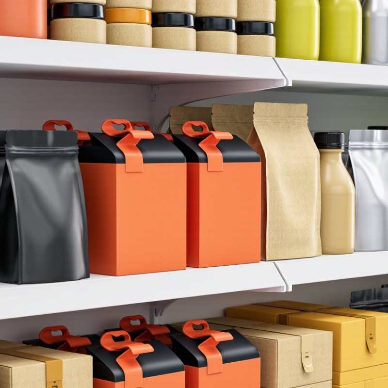
Brand recognition in 2026 means more than remembering a name. It means identifying a product quickly across shelves, screens, delivery boxes, and search results. Recognition now depends on consistent visual signals, useful information, and credible behavior. The 2024 State of Connected Customer report found that 73% of customers expect companies to understand their individual needs. Packaging supports this expectation through clear labels, familiar colors, readable details, and easy product comparison. A box is no longer silent.
Recognition also depends on memory under pressure. Consumers often scan packages for only a few seconds. Distinctive shapes, typography, textures, and opening experiences can strengthen that memory. The 2024 PwC Voice of the Consumer Survey reported that 46% of consumers would pay more for sustainably produced goods. However, sustainability claims must feel specific and verifiable. Vague green language can weaken trust. This is where packaging strategy still feels imperfect. A beautiful package may attract attention, yet confusing instructions can damage recognition after purchase. Real experience matters more than polished intention.
Tips:
Test packaging from a distance, then under poor lighting. Ask people to describe it without seeing the product name. Measure recognition, not just preference. Check whether accessibility, disposal guidance, and product benefits remain visible. Small details matter. Even strong designs need revision.
Packaging shapes consumer perception before a product is touched, opened, or tested. A matte carton can suggest calm quality, while a loud color may signal energy or urgency. These meanings are learned quickly. Research published in the Journal of Consumer Psychology shows that packaging design influences expected taste, quality, and usability. The effect is powerful, but not automatic. A beautiful box cannot repair confusing instructions or a poor opening experience.
Industry data supports this connection. The Paper and Packaging Board reports that 72% of consumers believe packaging design can influence purchasing decisions. PwC’s 2024 Voice of the Consumer Survey found that 46% of respondents were buying more sustainable products. This raises a practical challenge for packaging teams. Recycled material may support trust, but vague environmental claims can create doubt. Clear disposal guidance, visible material information, and honest claims work harder than decorative language.
Physical details matter in real shopping moments. Under bright store lighting, thin lettering can disappear. A glossy surface may look premium online but show fingerprints in use. In packaging audits, these small failures are easy to miss during design reviews. They become obvious at a kitchen counter. Size, texture, contrast, and opening motion should be tested with real users, not only internal teams. Recognition also depends on consistency across shelves, screens, and delivery boxes. Yet consistency should not become repetition without meaning. Consumer expectations change, and packaging must be reviewed as evidence changes.
Packaging becomes a brand’s first physical conversation with a shopper. In packaging audits, I have seen people recognize products before reading their names. That response rarely comes from one graphic. It comes from repeated signals. Color creates the quickest cue, but it needs a stable role across sizes and product variations. A distinctive shape can support memory on a crowded shelf. It should still stack, ship, and open without frustration. Small details matter.
Typography gives the package a voice. Wide lettering may feel calm, while compact type can suggest energy. Legibility must win, especially under dim store lighting or for older users. A clear information hierarchy guides the eye from product type to key benefit and essential details. Icons can strengthen recognition when they are simple and tested across cultures. Material adds another layer. Uncoated paper feels quiet, while a textured finish invites touch. Yet decoration should not disguise weak information.
Identity also depends on consistency. Repeated name placement, color logic, illustration style, and opening experience create reliable expectations. I recommend testing packages at arm’s length, in low light, and beside competing shapes. Real users often notice issues designers miss. Claims about recycled content or recyclability need evidence, not attractive wording. No package gets everything right. A vivid color may improve recognition but reduce accessibility. A premium texture may increase appeal but complicate recycling. Good identity leaves room for correction, measurement, and honest refinement.
| Brand Identity Dimension | Evidence-Based Data or Benchmark | Packaging Element | Impact on Recognition | 2026 Practical Application | Reference |
|---|---|---|---|---|---|
| Purchase influence | 72% of surveyed consumers reported that packaging design influences purchase decisions. | Overall visual system, structure, graphics, and shelf presence | Packaging can act as a rapid recognition cue before consumers read detailed product information. | Use a consistent visual hierarchy across products while reserving one prominent area for product-specific information. | Consumer survey by the Paper and Packaging Board, 2017 |
| Distinctive color | Color is processed rapidly and can support recognition when used consistently with sufficient contrast. | Primary color, secondary palette, and color-coding system | A stable color system helps consumers identify a product family from a distance and across retail channels. | Define a core palette, document color values, and test appearance under store, mobile, and low-light conditions. | Color and accessibility principles summarized from WCAG 2.2 and established visual-perception research |
| Typography and readability | WCAG 2.2 recommends a minimum contrast ratio of 4.5:1 for normal text and 3:1 for large text. | Typeface, weight, size, spacing, and information hierarchy | Readable typography makes the identity easier to recall and reduces confusion between product variants. | Use one recognizable type family, strong contrast, short front-of-pack messages, and clear variant labeling. | Web Content Accessibility Guidelines 2.2, Success Criterion 1.4.3 |
| Shape and structure | Structural form is a physical recognition cue that remains available even when graphics are partially hidden or viewed from the side. | Silhouette, opening method, closure, proportions, and tactile details | A consistent form can improve recognition in physical retail and strengthen memory through repeated handling. | Select a practical signature shape that is stable across sizes and compatible with transport, storage, and recycling requirements. | Packaging design and multisensory recognition principles; structural performance should be validated through user testing |
| Material and tactile experience | 67% of surveyed consumers said paper or cardboard packaging can make a product seem more premium. | Board grade, texture, coating, embossing, softness, and sound | Material cues communicate perceived quality and can make the product experience more memorable. | Match tactile choices to the intended positioning, but avoid finishes that compromise recyclability or make disposal unclear. | Consumer packaging research reported by the Paper and Packaging Board, 2017 |
| Consistency across touchpoints | Repeated exposure to consistent visual cues supports memory formation and lowers recognition effort across physical and digital environments. | Shared colors, typography, imagery, iconography, and layout rules | Consistency links packaging with websites, advertising, delivery materials, and social content. | Create a packaging asset library with approved templates for product pages, retail images, and user-generated content. | Brand identity and visual consistency principles from established identity-design research |
| Unboxing and social sharing | 40% of surveyed consumers said they would be likely to purchase again from a retailer that delivered a premium package; 50% said they would be likely to recommend it on social media when the package felt gift-like. | Opening sequence, interior print, protective inserts, and presentation | A memorable delivery experience can extend recognition beyond the shelf and encourage voluntary exposure online. | Design a simple, photogenic opening experience without excessive layers, filler, or difficult-to-recycle components. | E-commerce unboxing survey reported by Dotcom Distribution, 2016 |
| Sustainability signal | 57% of surveyed consumers reported that they were willing to change purchasing habits to reduce environmental impact. | Material efficiency, recycled content, recyclability, disposal guidance, and truthful claims | Credible sustainability cues can reinforce values-based identity, while vague or unsupported claims can weaken trust. | Show concise, verifiable disposal information and reduce unnecessary components before adding decorative sustainability messages. | Global consumer sustainability study by IBM Institute for Business Value and the National Retail Federation, 2020 |
| Information architecture | Mandatory information must remain legible and distinguishable from promotional content; labeling requirements vary by product category and market. | Front-of-pack message, product name, variant, benefits, instructions, and regulatory details | A predictable hierarchy lets consumers identify the product quickly and associate key messages with the same identity system. | Use a repeatable front-of-pack grid and verify legal, accessibility, and disposal information for every target market. | General labeling and accessibility requirements; confirm final text against applicable local regulations |
Smart and sustainable packaging now shapes how quickly people remember a product. A distinctive carton, pouch, or label can create recognition before the name is read.
That figure signals stronger expectations, not automatic loyalty. Packaging must still feel useful, clear, and trustworthy.
Smart features can make recognition more active. A QR code may reveal sourcing details, recycling instructions, or product authentication. Digital printing can also support limited designs without large inventory commitments.
GS1’s Digital Link guidance shows how connected identifiers can link physical packaging with changing online information.
However, a code hidden under a fold is easily ignored. Smart packaging is not magic. It needs a visible prompt and a fast mobile experience.
Sustainability improves recall when consumers can understand it at a glance. Paper texture, reduced material, and plain disposal instructions create physical cues.
Smithers’ market analysis continues to identify recyclability and lightweighting as major packaging investment areas.
Yet green claims without evidence can weaken credibility. Clear material labels, measured claims, and accessible certification details support E-E-A-T principles.
The imperfect part is balance: a highly technical pack may prove its sustainability but remain forgettable. A simpler pack may be memorable but less informative. Testing both recognition and disposal behavior is essential.
Packaging recognition is measurable, not a vague feeling. Teams can test whether shoppers identify a product before reading its name. In a controlled shelf test, participants view blurred package fronts for three seconds. Researchers record unaided recognition, color recall, shape recall, and confidence. Short exposure matters. A package that works only during close inspection may fail in a crowded aisle.
A useful study combines interviews with observed behavior. Ask participants to sketch the package from memory after a shopping simulation. Then compare their drawings with the actual package. Measure correct shape, dominant color, material cues, and distinctive symbols. Eye-tracking can show whether people notice the package within the first two seconds. Sales data adds context, but it should not stand alone. Price, placement, promotions, and stock gaps can distort recognition results.
Teams may track branded search, direct traffic, and repeat selection after packaging changes. They should compare exposed and unexposed groups over several weeks. A small lift can still matter if recognition improves among new shoppers. Yet our measures are imperfect. Survey answers can sound confident while shelf behavior tells another story. Lighting, distance, and language also affect results. Reliable reporting records the test setup, sample size, errors, and unanswered questions. That discipline makes packaging recognition easier to improve, not merely easier to claim.
Packaging-driven recognition is measured through consumer-response signals such as purchase influence, perceived product value, sustainability preference, and social sharing. These indicators act as practical proxies for evaluating whether packaging is memorable, distinctive, and strong enough to influence behavior.
Reported consumer-survey findings shown as percentages: packaging influence on purchase decisions, perceived premium value, willingness to pay more for sustainable packaging, and online packaging-image sharing. Figures represent published survey responses from 2017–2021 and are not company or brand performance data.
It means identifying a product quickly across shelves, screens, boxes, and search results. Recognition depends on familiar colors, clear labels, useful information, and credible behavior. A package is no longer silent.
Stable colors create quick visual cues. Distinctive shapes, typography, textures, and simple symbols strengthen memory. The package should still stack, ship, and open easily. Appearance alone is not enough.
Consistency builds reliable expectations across different sizes and product variations. Repeated color logic, name placement, illustrations, and opening experiences can support recognition. Small changes may still confuse regular shoppers.
Show participants blurred package fronts for three seconds. Record unaided recognition, color recall, shape recall, and confidence. Test from a distance and under poor lighting. Short exposure matters.
Ask participants to sketch the package after a shopping simulation. Compare their drawings with the real package. Check the shape, dominant color, material cues, and symbols. Memory is often incomplete.
Not by itself. Price, shelf position, promotions, and stock gaps can affect sales. Compare exposed and unexposed groups over several weeks. The numbers may still need careful interpretation.
Claims should be specific and supported by evidence. Disposal guidance must remain easy to find. Vague green language can weaken trust. Attractive wording cannot replace proof.
Yes. A vivid color may improve recognition but reduce accessibility. A premium texture may feel appealing but complicate recycling. Clear information should outrank decoration. Even successful designs need revision.
In 2026, brand recognition means more than remembering a name or logo; it reflects how quickly and accurately consumers identify a company through consistent visual, functional, and emotional cues. This explains why is packaging important for brand recognition: packaging often creates the first physical interaction with a product and can influence perceptions of quality, reliability, personality, and relevance. Color, typography, shape, materials, graphics, labeling, and opening experiences work together to build a clear and memorable brand identity across physical and digital shopping environments.
Smart and sustainable packaging can further improve recall by adding interactive features, traceability, personalization, reusable formats, and environmentally responsible materials without sacrificing convenience or clarity. To understand its impact, brands can measure recognition through aided and unaided recall surveys, packaging tests, repeat purchases, online engagement, customer feedback, and comparisons between different designs. When packaging remains distinctive, useful, consistent, and aligned with consumer values, it strengthens recognition and supports lasting relationships.

Ariqa Fashion